Plot estimated intensity of Hawkes processes and assess goodness of fit via QQ plots
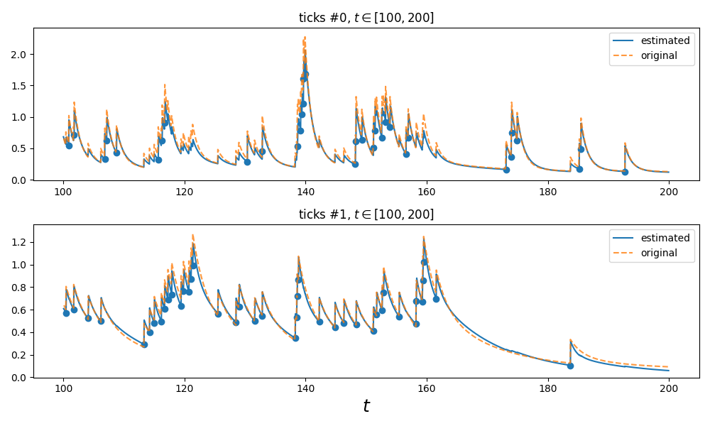
This examples shows how the estimated intensity of a learned Hawkes process can be plotted. In this example, the data has been generated so we are able to compare this estimated intensity with the true intensity that has generated the process.
Python source code: plot_hawkes_estimated_intensity.py
import matplotlib.pyplot as plt

from tick.hawkes import (
    SimuHawkesSumExpKernels,
    HawkesSumExpKern
)
from tick.hawkes import SimuHawkesExpKernels  # NOQA
from tick.hawkes import HawkesExpKern  # NOQA
from tick.plot import plot_point_process, qq_plots


##########################################################################
# simulate
##########################################################################
Simulator = SimuHawkesSumExpKernels
end_time = 1000
decays = [0.1, 0.5, 1.]
baseline = [0.12, 0.07]
adjacency = [[[0, .1, .4], [.2, 0., .2]], [[0, 0, 0], [.6, .3, 0]]]
model = Simulator(
    adjacency=adjacency,
    decays=decays,
    baseline=baseline,
    end_time=end_time,
    verbose=False,
    seed=1039,
)
model.track_intensity(0.1)
model.simulate()


##########################################################################
# fit
##########################################################################
timestamps = model.timestamps
Fitter = HawkesSumExpKern
decays = [0.1, 0.5, 1.]
kwargs = {}
if Fitter == HawkesSumExpKern:
    if 'penalty' not in kwargs:
        kwargs['penalty'] = 'elasticnet'
        kwargs['elastic_net_ratio'] = 0.8
learner = Fitter(decays=decays, **kwargs)
learner.fit(timestamps)


##########################################################################
# plot intensities
##########################################################################
t_min = 100
t_max = 200
show = True
fig, ax_list = plt.subplots(2, 1, figsize=(10, 6))
learner.plot_estimated_intensity(model.timestamps, t_min=t_min,
                                 t_max=t_max, ax=ax_list)
plot_point_process(model, plot_intensity=True, t_min=t_min,
                   t_max=t_max, ax=ax_list)

# Enhance plot
for ax in ax_list:
    # Set labels to both plots
    ax.lines[0].set_label('estimated')
    ax.lines[1].set_label('original')

    # Change original intensity style
    ax.lines[1].set_linestyle('--')
    ax.lines[1].set_alpha(0.8)

    # avoid duplication of scatter plots of events
    ax.collections[1].set_alpha(0)

    ax.legend()

if show:
    fig.tight_layout()
    plt.show()


def simulated_v_estimated_qq_plots(
        model,
        learner,
        show=True,
):
    fig, ax_list = plt.subplots(2, 1, figsize=(10, 6))
    timestamps = model.timestamps
    end_time = model.end_time
    learner.qq_plots(events=timestamps, end_time=end_time, ax=ax_list)
    model.store_compensator_values()
    qq_plots(model, ax=ax_list)

    # Enhance plot
    for ax in ax_list:
        # Set labels to both plots
        ax.lines[0].set_label('estimated')
        ax.lines[2].set_label('original')

        # Change original intensity style
        ax.lines[2].set_alpha(0.6)
        ax.lines[3].set_alpha(0.6)

        ax.lines[2].set_markerfacecolor('orange')
        ax.lines[2].set_markeredgecolor('orange')

        ax.legend()

    if show:
        fig.tight_layout()
        plt.show()
    return fig
Total running time of the example: 0.10 seconds ( 0 minutes 0.10 seconds)
- Mentioned tick classes: